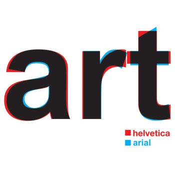
You had me at hellovetica.
Fonts. There are so many of them, which allows us to express ourselves in different ways. We’ve all been there. Trying to create a project in grade school or a birthday card for your best friend and deciding which fUn AnD fUnKy font we want to use to really make it pop.
In the design world, a font can make or break your design.
Serif or sans serif? Are the letters close enough together or should they be further apart? Does this accurately represent the brand across all media while also showing off their personality?
So, Helvetica, the world’s most popular font, is getting a facelift after 62 years. Charles Nix, the director of Monotype, the world’s largest type company — which currently owns the licensing rights to Helvetica — decided so. This came after major companies that had used Helvetica for years abandoned ship. Companies such as Google, IBM and Netflix.
Helvetica Now will have a few updates to all 40,000 characters.
The changes include:
- Greater legibility on all surfaces. From the tiny screen of an Apple Watch to the big screen of a billboard.
- Evening-out of the kerning for larger type sizes.
- Incorporation of more white space into the design for greater legibility.
- Restoration of some of the original characteristics of the font, such as a single-story lowercase “a” and a capital “R” with straight legs.
As a local advertising agency that has worked with tons of businesses in Columbia, South Carolina, and beyond to create their brands, we couldn’t help but get excited over this facelift. What are your thoughts?


Comments are closed.