Normally, we marketers try to make things as visually appealing as possible — our own Brian Murrell sees to that for ADCO’s clients. Attractive colors that complement each other are an important part of his toolbox.
But what if the task at hand was to make consumers want to turn away, to spurn your product?
That would be a job for… The Ugliest Color in the World!
Here’s the story:
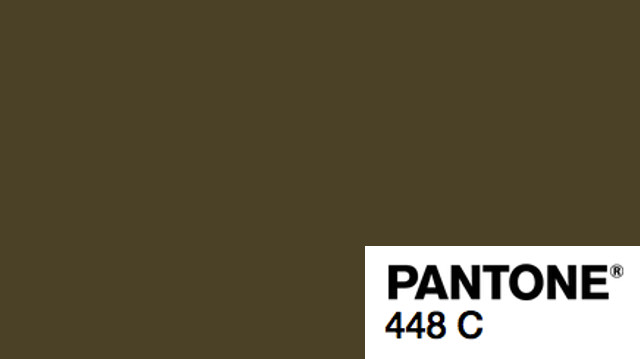
Colors can conjure up a lot of associations, but apparently only one specific hue has the power to “minimize appeal” and “maximize perceived harm.” That’s right – researchers pinpointed the world’s ugliest color, and it’s been lovingly described as “dirty,” “tar,” and even “death,” just to name a few associations.
Pantone 448 C, also called “opaque couché,” may get a bad rap, but this sewage-tinged hue actually has an important mission. Out of the entire rainbow, experts chose the green-brown shade to discourage smoking. And one look at this swatch will convince you of its habit-breaking abilities. It’s not for the faint of heart, but here it is:
Disgusting, right? Back in 2012, the Australian government hired research agency GfK to spearhead the new package design for all tobacco products. But instead of the marketing firm’s usual goal, they had to accomplish the opposite. Every carton had to look as unappealing as possible. …
And it was decided that this color did the job.
Here’s hoping we haven’t spoiled your appetite…


Comments are closed.